It's a Cube is released!
3 months ago, I started my second public game development project. The idea behind this project was to be a simple type of game where the player's only objective was to get the highest score they possibly could, the same thing classic arcade games primarily focus on. To play, the player rotates a 6-colored cube using the arrow keys to face the side matching the color of the ground downwards (towards the ground) before the timer on the bottom of the screen reaches zero. The idea originally sprouted after a conversation I had in the comments of a YouTube community post by the channel Speed Tutor, a commenter had mentioned that realistic art wasn't important to the visual quality of a game, and what truly matters is having a cohesive design and aesthetic along with good game-play, and Speed Tutor himself replied to that comment jokingly saying "what if there were only the default Unity cubes" and I responded to this with "I bet I could make a fun game using only cubes." After that I thought more about it, and eventually came up with the idea behind It's a Cube. At the time I was on the tail-end of developing Deathly Descent, which was my first public project, and I decided that this would be my next project after I finished DD. Three months later, I've finished It's a Cube, and I'm really happy with how it turned out! I want to take a few moments to reflect on this project and share what I think I was able to improve on from Deathly Descent, but also the new mistakes I found I made with this game.
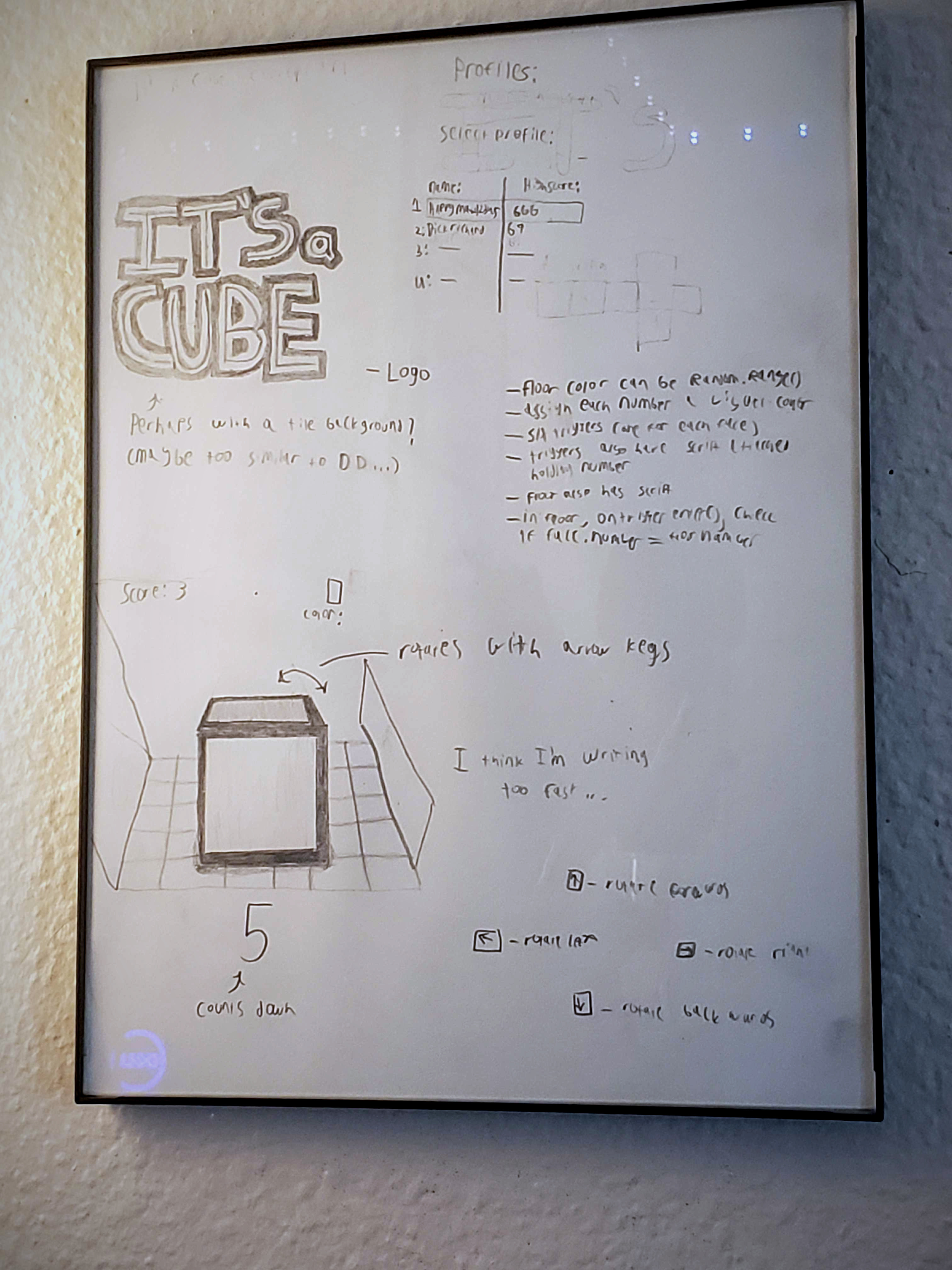
Development-wise, this project went significantly better than Deathly Descent. I spent a lot more time planning how I was going to build and design this game, which gave me a guideline to follow when I actually started building it. I wrote out a few things about the game, and drew some concept art, which I then hung next to my setup in a little frame.

I managed to apply what I learned from the DD project in this project, and devoted much more time to cleaning and organizing my code than I did with DD. I found that when errors would spring up, as they often do, it only took me a few minutes to track them to their source and eliminate them, whereas in DD I often had to spend 20+ minutes wading through code trying to make sense of the mess I had created before any real work could be done. I believe one of the main reasons It's a Cube's code was easier to comprehend than DD's is because I took care to refrain from making classes codependent and when class dependencies were necessary, I kept it a one-way dependency. One of my rules for future projects will always be "One-way dependencies ONLY" I also tried to limit how many dependencies a single class had, but I believe I could have done better about this, and I want to improve on this for my next game.
It's a Cube didn't get anywhere near as much attention as Deathly Descent has, however. I realize that the fact that DD is free, while It's a Cube costs a dollar is part of the reason, but I feel like I made a few mistakes when launching the project and promoting the game after that that I want to learn from for my next game. I think my first mistake was making the earliest version public. When I made the page, I published the tech demo along with it, which was clunky and incomplete. Next time I want to wait a little bit to make the page for the game until I have something more complete to show for it, and possibly refrain from making public builds until the game is closer to finished. I also believe I could have promoted the game better on my YouTube channel through my devlog series. I watched the DD devlog series again and I noticed that from devlog 4 onward I always mentioned the tagline for Deathly Descent within the first 30 seconds of the video, and I didn't do that for my It's a Cube devlogs, aside from the one linked above, I wanted to try to change that. Better late than never, I suppose. I think I will come up with a tagline for my next game and work out a good intro for my devlog videos before I start my next project.
It's been fun working on this game, though! If you're interested I encourage you to check out the game-play teaser on my YouTube channel and buy the game if it looks like something you'd enjoy playing! Thank you for taking the time to read this, and have a nice day!
- Matt
Files
Get It's a Cube
It's a Cube
Well there's more to it than that...
| Status | Released |
| Author | HappyMatt12345 |
| Genre | Puzzle |
| Tags | 3D, Arcade, Low-poly, Singleplayer |
| Languages | English |
More posts
- Version 2.2Jan 04, 2024
- Version 2.1Dec 31, 2022
- Version 1.5Nov 09, 2022
- Versions 1.3 and 1.4Nov 05, 2022
- How the cube interacts with the groundOct 27, 2022
- Version 1.2 (and 1.2.1)Oct 27, 2022
- Version 1.1Oct 10, 2022
- It's a Cube first beta release (v1.0)Oct 04, 2022
- So... It's a cube!Sep 30, 2022

Leave a comment
Log in with itch.io to leave a comment.